Thoughts on the Kingdom

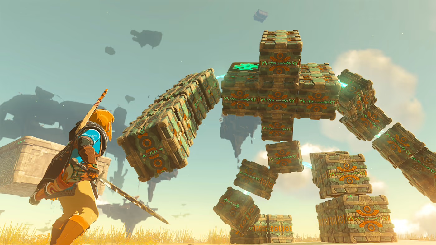
It’s been almost two months since I finished the main story of the long-awaited latest installment in the Zelda series, and over a month since I last played. There’s plenty of side missions left to do, but I had no desire to return. That’s not entirely to blame on the game – my personal life has been imploding a fair bit again. Still, this feels very different from Breath of the Wild. I was glued to that game until I had finished every last bit. 1
It might sound like I didn’t enjoy Tears of the Kingdom, but that couldn’t be further from the truth. It is a very competent sequel, and it is pretty much exactly what I hoped for. And yet, it is not even in the same league as BOTW. Which is a weird, maybe even unfair thing to say – the two are so similar, and TOTK is mostly BOTW “but more”. That’s just it, though: BOTW came, and there was nothing before. It went from nothing to BOTW. Whereas TOTK is… BOTW+. It went from BOTW to… well, more BOTW.
So it is a great game because it’s BOTW and BOTW is a great game. But just like you can only ever watch The Matrix for the first time in your life once, you can only be surprised and awed by BOTW once. This is what TOTK lacks, despite efforts to capture lightning in a bottle again. Gameplay-wise I must admit those efforts fell mostly flat for me. The sky islands feel like a gimmick, besides the few that are essential to main story missions. The Depths – the big thing that was kept secret until release – are a waste. I am pretty baffled that this is apparently not a universally shared opinion. To me, exploration in the darkness was dull and monotonous. It also forced one of the more annoying mechanical changes into the gameplay:
Lighting the Depths up with brightbloom seed arrows is annoying because of the new way arrows work – I much preferred having more limited variety to having to craft each individual arrow before firing it. The lack of UX improvements over BOTW feels odd given how long the game was in development – it felt surprisingly unpolished at times.
Ultrahand is the best new mechanic, but it gets tiring to use quickly. So many riddles2 and situations where I knew what to do within seconds, and then spent minutes actually doing it due to the clunky UI. Autobuild helps, but comes too late in the normal progression. It doesn’t solve the problem entirely, and has its own.
Undoubtedly the worst change is the champions/sages: The new abilities are not as useful and fun, but I suppose that’s rather subjective. However, the fact that you have to walk up close to a companion that constantly moves around you to get the button prompt for activating the abilities is just objectively awful. Whenever you need them, they are not close enough and almost running away from you. When you don’t need them, they block the camera and cause unintended activations as the button has other uses. Just mind-boggingly bad design.
All that said, the story more than made up for all the negatives. I enjoyed the additional lore a lot, and it even further elevated BOTW by rounding things out nicely. Understanding why TOTK has its name is one of my favorite gaming moments in recent history. Again: TOTK is a great game, even though I mostly wrote negatively about it. If you want to know what makes TOTK great, look for a BOTW review.
No, not all the Koroks – but I collected enough of those to upgrade everything to the max despite not actually needing further upgrades. ↩︎
I think the shrines overall were a lot weaker in TOTK. They felt more like a never-ending series of mini-tutorials that taught me things I then never really needed again compared to the actual riddles in BOTW. ↩︎
