It's selfie time!
Now that I’ve been doing it for three years this trend is finally getting the attention it deserves: The Oxford Dictionary named “selfie” as word of the year, the pope as well as other people are doing it, and just recently Apple introduced a special “Sharing Selfies” section in the App Store.
But of course “selfie” has a broader meaning. I’m still talking about what I did in year one and two: One picture of myself every evening at the same time and in the same exact angle/distance, so that an awesome video of my hair and beard (re-)growing can be created out of them. ;)
With a total of 1055 pictures, that video now has a runtime of more than 70 seconds at 15 frames per second. Here it is: me, from March 26th 2011 to March 26th 2014.
Warning! The actual video has rapidly fast picture changes, beware if you’re epileptic.
Just like last year, you can also watch a slower version with ten fps if you want to take a closer look.
To give some perspective just how long three years really is: During that video I (finally) graduated from university, lost 20 pounds (twice, actually), and spent almost six weeks watching more than 500 movies. When I started, Bin Laden was still alive and Occupy Wall Street had not happened yet.
After more than a thousand of them, taking those pictures has become an essential part of my daily routine. That means less questions by friends and colleagues, more and more people instantly getting why I’m suddenly “freezing” with my iPhone in front of my face and quickly jumping in behind me, and most of all: The best “success rate” I’ve had so far. I missed just four pictures for a perfect run this year — and as far as I can remember two of the missing pictures are from nights with no sleep at all (and as we all know the day ends when you go to bed, not at midnight). Here are all three years in comparison:
| period | 2011/12 | 2012/13 | 2013/14 |
|---|---|---|---|
| pics / days | 349 / 366* | 345 / 365 | 361 / 365 |
| rate | 95,36% | 94,52%** | 98,90% |
** I lost 16 pictures in year two because iCloud backups suck
Causa Everyday
In both my last posts I’ve been ranting about the app I’m using to take my pictures. I feel abandoned and forsaken by the developers, and despite the ridiculously low price I still stand by the statement that how they are handling their app is no way to treat customers.
Quick recap: After more than a year without any activity on the app their Twitter account claimed that the big next version update was coming soon, “swear to god”. iOS 5 had already been released. Nothing happened. iOS 6 came along. The iPhone 5 came along. iOS 7 came along, the iPhone 5S came along. Lots of big changes, according to App Store reviews the app stopped working for many people. The tweet promising version 2.0 was 17 months old when the iPhone 5S was released.
So when in last October there actually was an update for the app, I almost couldn’t believe it. 1,5 years after that tweet, more than 2,5 years after the last update. Could this be true? Was it finally happening? Ha, good one! I kid you not, these are the actual release notes of the update:
BUG FIXES!!!
• Camera works on iOS 7.
• Import/Export fixed.
• Flat icon.
• Auto Upload to Facebook/Flickr/Twitter has been disabled for now as we work to fix it, sorry for the inconvenience.
Thank you for your patience, we love you all very much <3
Well, there you go. An essential feature stopped working, so please enjoy this update in which we fucking removed it. Oh, and you’ve been using the latest version of iOS, which came out a month ago and was in beta for four months? We figured that after three (!) major iOS updates came out after our app, we’d do you a solid and make our app work again. (On a side note: People had been complaining about the Import/Export problems for years as well, it’s one of the reasons for the rather complicated backup/storage system I detailed in last year’s post.) Needless to say that since this update there has not been another one to restore the lost functionality.
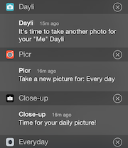
Everyday is dead, long live every day
Luckily, there finally are some sensible alternatives. I’ve tested all of them and feel quite confident of having found a worthy successor. Below you’ll find quick reviews of Picr, Close-up and Dayli – if there are any other apps that could serve as an alternative, please let me know.
Picr
- Released: 12/2013, three major updates since
- Current rating 4.5/5, price alternates between free and $0.99, pro upgrade for $1.99
Can save to camera roll, allows multiple projects (pro only), allows switching between front and back camera, has a grid and can overlay the last image. The grid is not configurable, which is my biggest complaint. Comparing the newly taken photo with the previous one is more annoying than in Everyday: You first have to save the photo, then go into the list and can compare them there by swiping (the image switches instantly and not in a swiping animation, which is crucial for being able to really compare them), which is not as easy as just a single tap anywhere on the image like in Everyday. Saving/exporting videos is only possible in the pro upgrade.
Close-up
- Released: 06/2012, six major updates since
- Current rating 4.5/5, free, two IAP for $0.99 each
The weakest contender and instantly disqualified by not having a grid at all. Overlay is nice, but the grid is what really helps you get well-aligned photos. It is much simpler than the other two, allowing only for one project. However, besides camera roll it can also save to Dropbox, which I’d actually prefer. It also lets you enter a location (I think suggestions are grabbed from foursquare) for each photo. Videos can be exported at any framerate between 1 and 28 FPS, for $0.99 you can buy a GIF export option. Same price for video sharing.
Dayli
- Released: 11/2013, two major updates since
- Current rating 4.5/5, price alternates between free, $0.99 and $1.99
My favorite of the bunch offers the same basic feature set as Picr: Save to camera roll, multiple projects, switching between the cameras, overlay and grid. The grid is highly customizable, though, letting you set as many guidelines as you want and at any angle. (Pro-tip: Double tap to align make the guide snap to a vertical or horizontal line.) The button for switching the overlay on and off while taking a picture is to the left side of the shutter, which is not a good place, as you’ll always shake the phone when trying to press it one-handedly. Anyways, thanks to the awesome grid this is not really an issue.
The biggest problem is that currently there is no way to quickly compare your new photo with the last one. Just like in Picr, you’re not given a choice after taking your photo but it is saved instantly. Sadly, in Dayli there is an actual swiping animation when swiping between the images, so you can’t see how the two pictures compare at all. I’ve asked the developer about it and a better way to handle this will most likely be included in the future. Then Dayli will fit my needs perfectly.
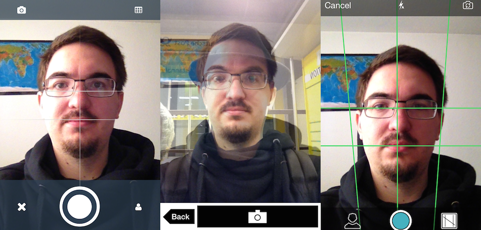
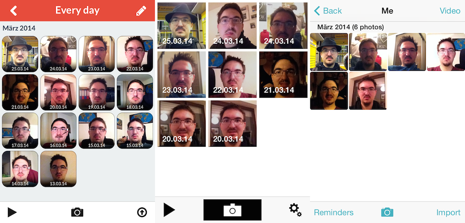
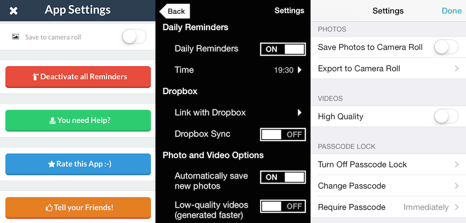
Screenshot comparison
From left to right: Picr, Close-up, Dayli
Taking a picture
Picture list
Settings
Ermahgerd, freebies!
Congratulations, you might be rewarded for actually reading all that! Just like I once did for one of my favorite iOS games, Strategery, I’m putting my money where my mouth is. I wish for Dayli to succeed so I will be able to use it even longer than Everyday, preferably without being so profoundly frustrated with it for most the time. ;)I’m thus giving away 10 copies of Dayli. First come, first serve – just drop me a line. All gone!
